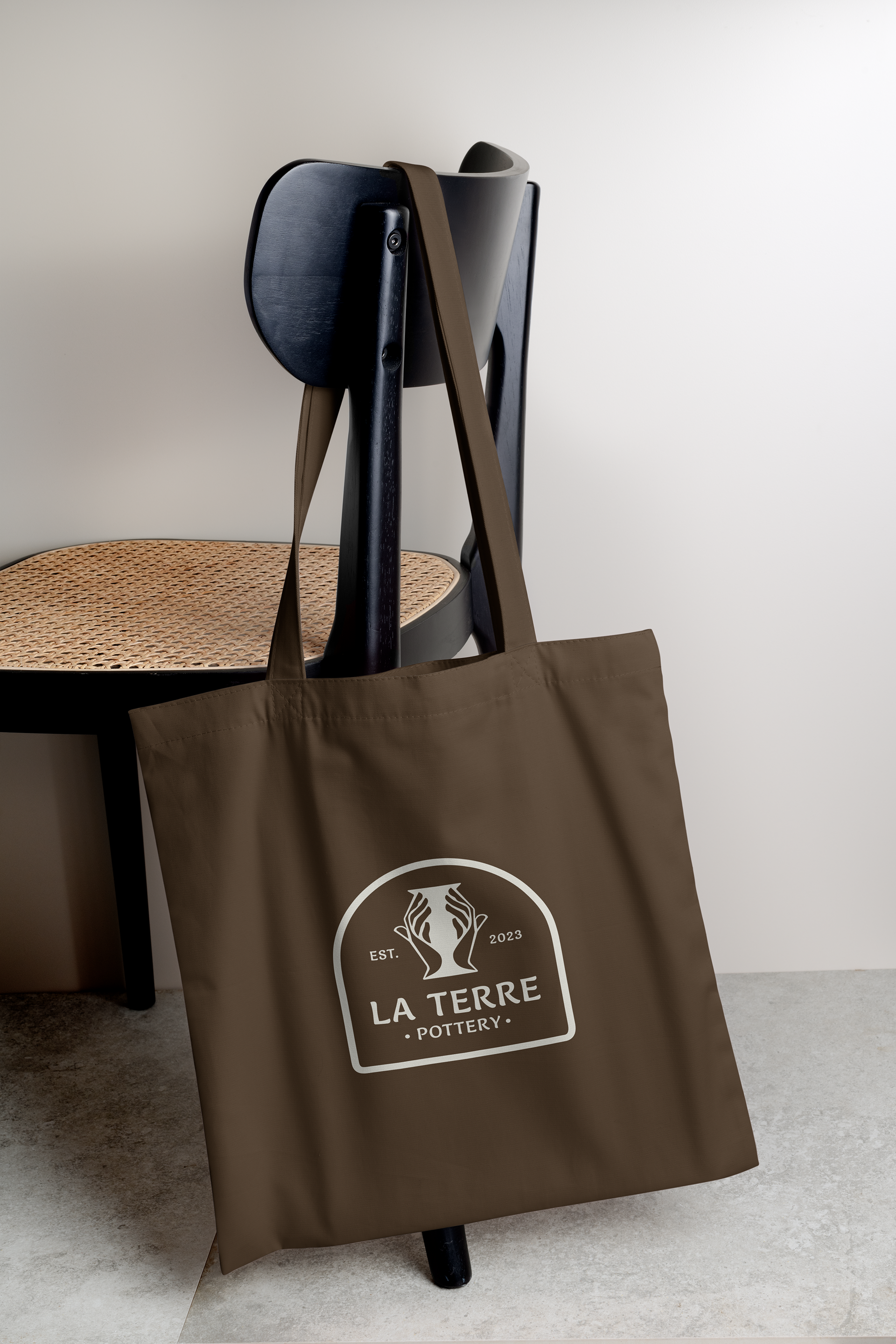
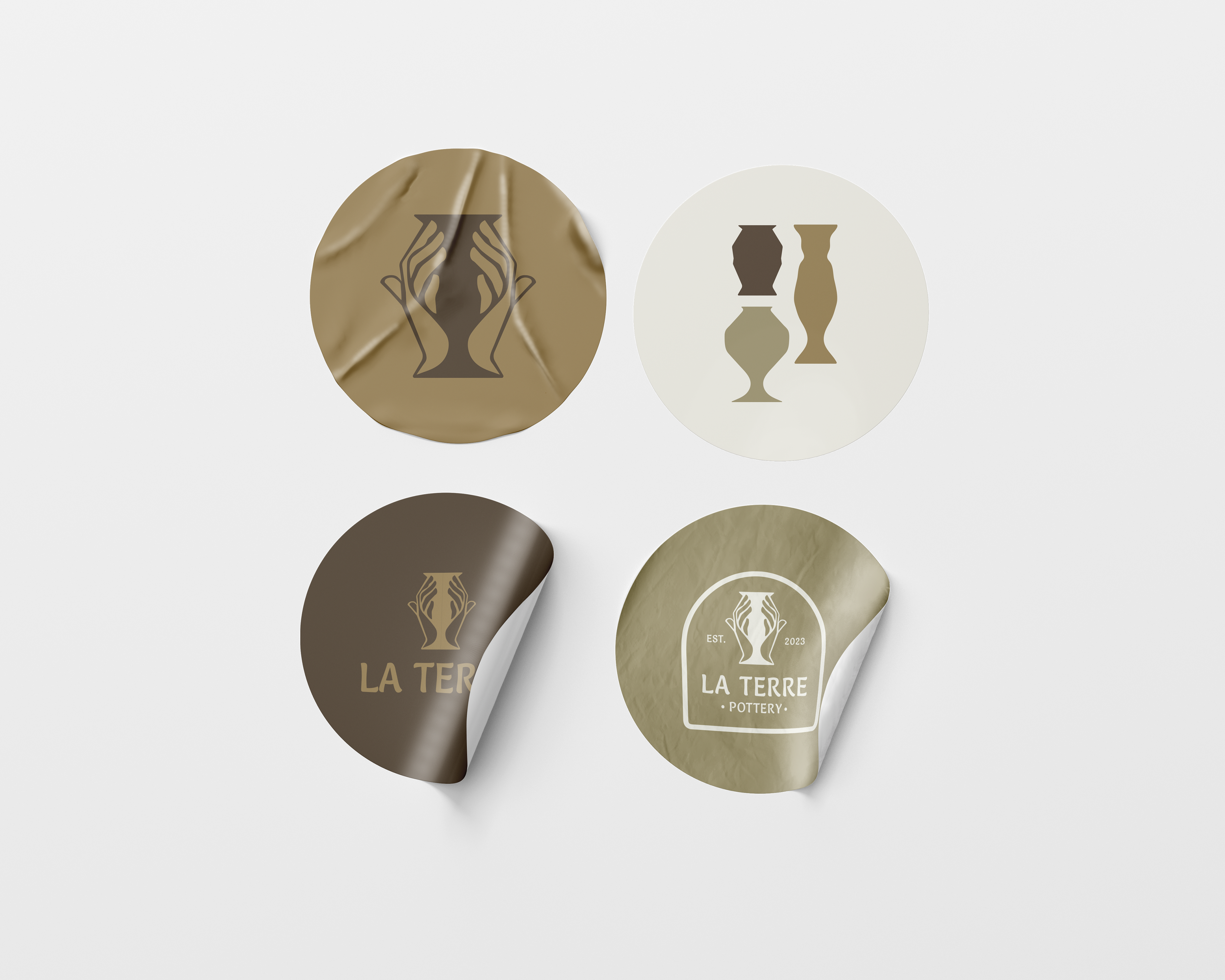
La Terre is a locally owned pottery studio. They were looking for a logo to show off the mood and purpose of their store. With their name meaning earth and soil, I chose to go with an earthy color palette that would both do justice to the name and the purpose of this small shop.
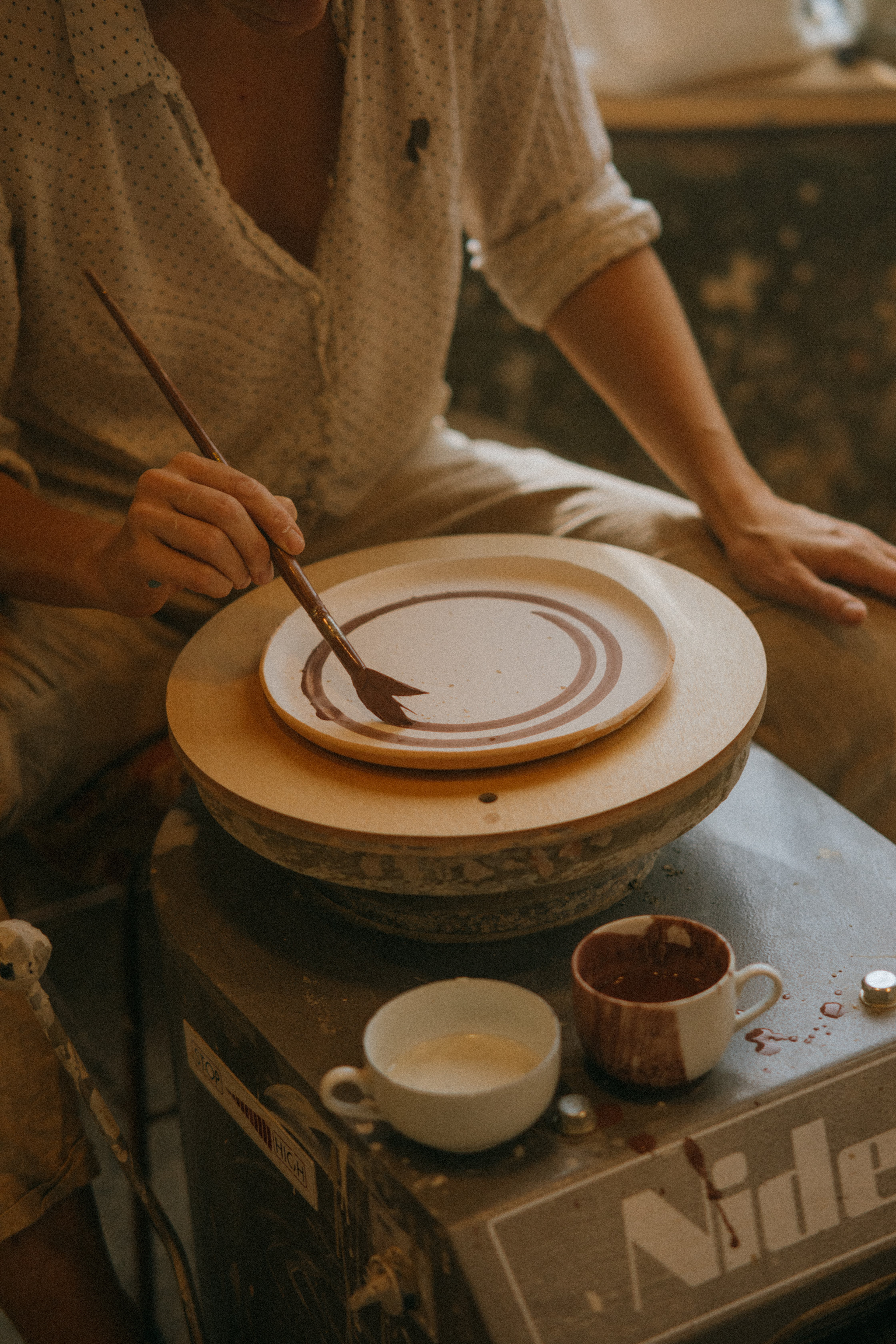
La Terre offers a wide range of workshops to help their customers and clients start exploring the art of pottery.
PRIMARY LOGO:
SECONDARY LOGO MARKS:
LOGO BREAKDOWN:


ROUGH DRAFT/DESIGN PROCESS SKETCHES:
